CircleMenu is a non-visible MIT App Inventor extension that renders a floating circular menu overlay on top of any screen. It supports a central toggle button and up to 8 surrounding sub-menu items, each with custom colours and icons. The menu can be positioned anywhere on screen using gravity constants and optional pixel margins.
Events:
OnMenuSelected
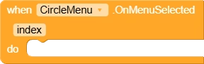
Fired when the user taps a sub-menu item. ‘index’ is the 0-based position of the selected item in the order they were added with AddSubMenu.
| Parameter | Type |
|---|---|
| index | number |
OnMenuOpened
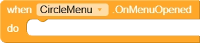
Fired after the circular menu finishes its opening animation and all sub-menu items are fully visible.
OnMenuClosed
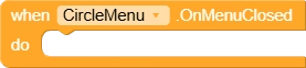
Fired after the circular menu finishes its closing animation and returns to the single central button state.
Methods:
Create
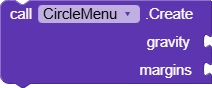
Creates and displays the floating circular menu overlaid on top of the screen. Use a Gravity property (e.g. GravityBottomRight) to position the menu. Margins is a list of 4 numbers [left, top, right, bottom] in pixels; pass an empty list for no margins.
| Parameter | Type |
|---|---|
| gravity | number |
| margins | list |
OpenMenu

Programmatically opens the circular menu if it is currently closed. Triggers the opening animation and fires OnMenuOpened when complete.
CloseMenu
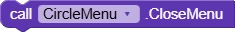
Programmatically closes the circular menu if it is currently open. Triggers the closing animation and fires OnMenuClosed when complete.
isMenuOpened
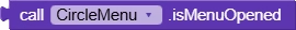
Returns true if the circular menu is currently in the fully open (expanded) state, false otherwise.
Return Type: boolean
SetMainMenu
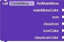
Configures the central toggle button of the circular menu. mainMenuColor sets the button background color. icon is the image shown when the menu is closed; closeIcon is shown when it is open. Pass -1 for iconColor or closeIconColor to keep the drawable’s original colors, or pass a color integer to tint the icon.
| Parameter | Type |
|---|---|
| mainMenuColor | number |
| icon | text |
| closeIcon | text |
| iconColor | number |
| closeIconColor | number |
AddSubMenu
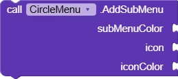
Adds a sub-menu item to the circular ring. Up to 8 items can be added. subMenuColor sets this item’s circle background color. icon is the image displayed on the item. Pass -1 for iconColor to use the drawable’s original color, or pass a color integer to tint it. Items are distributed evenly around the ring in the order they are added.
| Parameter | Type |
|---|---|
| subMenuColor | number |
| icon | text |
| iconColor | number |
SetShadowRadius
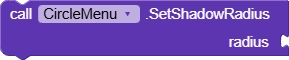
Sets the drop-shadow radius (in pixels) rendered beneath each menu button. A larger value produces a softer, wider shadow. Default is 5.
| Parameter | Type |
|---|---|
| radius | number |
SetPressedColor
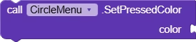
Sets the highlight color shown on the central menu button when it is pressed. Use UseHex to convert a hex string to a color integer.
| Parameter | Type |
|---|---|
| color | number |
SetIconSize
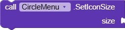
Sets the size (in pixels) of the icons drawn inside every menu button, including both the central button and all sub-menu items.
| Parameter | Type |
|---|---|
| size | number |
UseHex
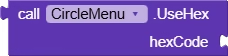
Converts a hex color string (e.g. ‘#FF5733’ or ‘#3399FF’) to an ARGB color integer that can be passed to color parameters of other CircleMenu blocks.
| Parameter | Type |
|---|---|
| hexCode | text |
Return Type: number
Properties:
GravityTopLeft

Gravity constant that positions the menu in the top-left corner of the screen.
GravityTopCenter

Gravity constant that positions the menu at the top-center of the screen.
GravityTopRight

Gravity constant that positions the menu in the top-right corner of the screen.
GravityCenterLeft

Gravity constant that positions the menu vertically centered along the left edge.
GravityCenter

Gravity constant that positions the menu exactly in the center of the screen.
GravityCenterRight

Gravity constant that positions the menu vertically centered along the right edge.
GravityBottomLeft

Gravity constant that positions the menu in the bottom-left corner of the screen.
GravityBottomCenter

Gravity constant that positions the menu at the bottom-center of the screen.
GravityBottomRight

Gravity constant that positions the menu in the bottom-right corner of the screen. Ideal default for FAB-style menus.