AnimatedGradient smoothly animates between multiple colours on any visible component’s background. Supports configurable orientation, border styling, and full playback control (start, pause, resume, reverse, end).
Events
ErrorOccured
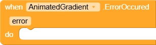
Fired when an error occurs during gradient setup or animation. The ‘error’ parameter contains the exception message to help identify the cause.
| Parameter | Type |
|---|---|
| error | text |
Methods
CreateAnimatedGradient
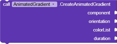
Applies an animated gradient background to the given component. ‘component’ is the target view, ‘orientation’ defines the gradient direction (use the orientation properties), ‘colorList’ is a list of color integers to animate between, and ‘duration’ is the full cycle time in milliseconds. Fires ErrorOccured if setup fails.
| Parameter | Type |
|---|---|
| component | component |
| orientation | any |
| colorList | list |
| duration | number |
EndAnimation
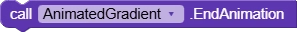
Permanently stops the gradient animation and resets it to its initial state. Use StartAnimation to play it again from the beginning.
StartAnimation
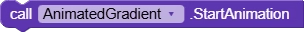
Starts the gradient animation from the beginning. Should only be called after CreateAnimatedGradient has been set up or after EndAnimation has been called.
PauseAnimation
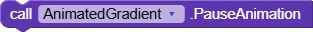
Pauses the gradient animation at its current frame. The animation can be resumed from the same point using ResumeAnimation.
ResumeAnimation

Resumes a previously paused gradient animation from where it left off. Has no effect if the animation is already running.
ReverseAnimation

Reverses the direction of the gradient animation, playing it backwards from its current position. Useful for ping-pong or undo-style visual effects.
ParseColor
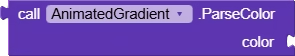
Converts a HEX color string (e.g. ‘#FF5733’ or ‘#80FF5733’ for alpha) into an integer color value that can be passed into the colorList for CreateAnimatedGradient.
| Parameter | Type |
|---|---|
| color | text |
Return Type: number
Properties
Border
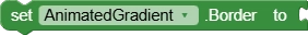
Enables or disables a border around the gradient background. Set to true to show a border, false to hide it. Use BorderWidth and BorderColor to style it.
BorderWidth

Sets the thickness of the gradient border in pixels. Only visible when Border is set to true.
BorderColor
Sets the color of the gradient border. Only visible when Border is enabled. Accepts a color value from the color picker or ParseColor block.
LeftToRight

Gradient orientation that flows horizontally from the left edge to the right edge of the component.
BottomToTop

Gradient orientation that flows vertically from the bottom edge upward to the top edge of the component.
RightToLeft

Gradient orientation that flows horizontally from the right edge to the left edge of the component.
BottomLeftToTopRight

Gradient orientation that flows diagonally from the bottom-left corner to the top-right corner of the component.
TopLeftToBottomRight

Gradient orientation that flows diagonally from the top-left corner to the bottom-right corner of the component.
TopRightToBottomLeft

Gradient orientation that flows diagonally from the top-right corner to the bottom-left corner of the component.
BottomRightToTopLeft

Gradient orientation that flows diagonally from the bottom-right corner to the top-left corner of the component.